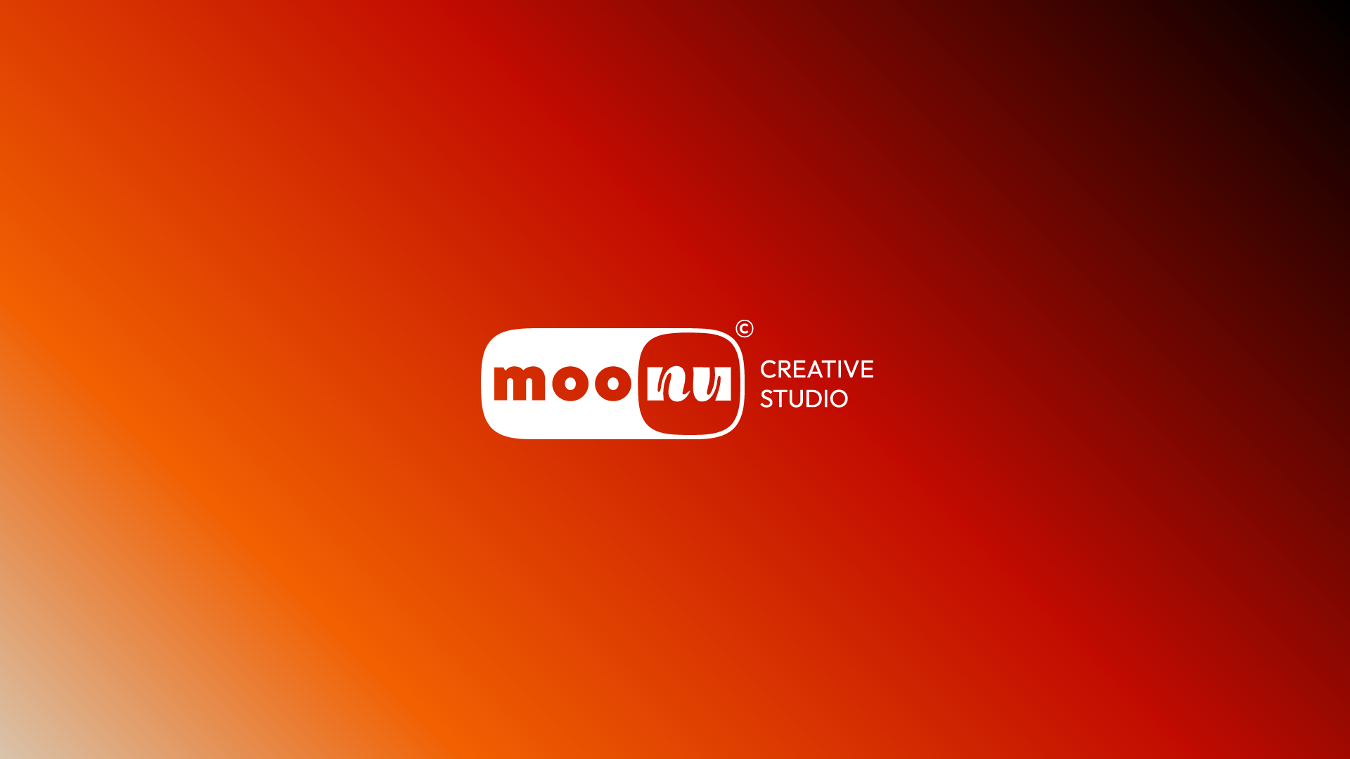
Moonu -
creative studio
Identity
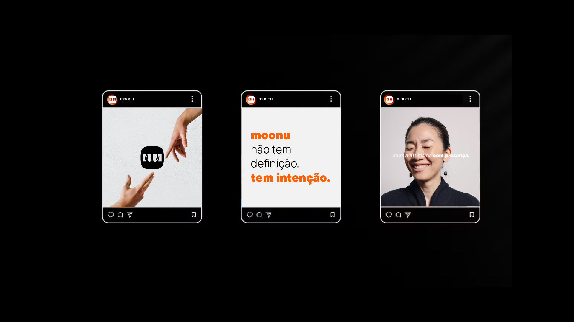
The moonu brand is born with a clear purpose: to transform ideas into real, human and meaningful presences. For this, a visual identity was carefully developed capable of translating this essence in an authentic and engaging way.
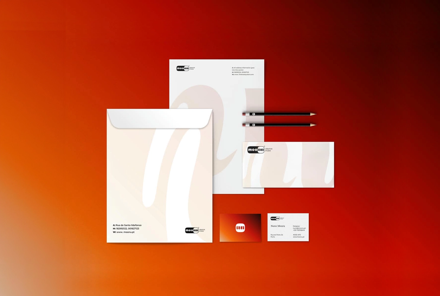
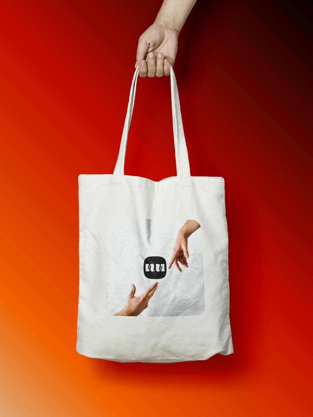
The moonu logo expresses the duality between structure and emotion. It represents a studio that combines digital functionality with a creative and authentic identity, where professional rigor coexists with artistic freedom, showing that design can be simultaneously useful, inclusive and deeply personal.
➔

➔
The rounded frame is inspired by digital buttons, suggesting interactivity and active presence. The "moo" typography is stable and accessible; the "nu", fluid and expressive. This visual contrast reveals your essence: a balance between logic and intuition, between grid and creative scratch.


Curious to see what we can create together?
Send a message to open doors to your brand!